For the upcoming Firefox 3.1 release a lot of work has been going into improving its CSS support (specifically, in relation to the CSS 3 specification).
One areas that have received solid implementations is that of border-image. This is a new CSS 3 module that makes the exact slicing of images (and their positioning around an element) quite easy.
The most obvious use case for them exists in constructing beautiful scalable buttons. And there is, perhaps, no better use case than the one provided by the iui library: replicating portions of the iPhone user interface in a pure-CSS manner.
Here are two examples from the iui library (slightly tweaked to support both WebKit’s and Mozilla’s implementations of border-image).
You will need a nightly release of Firefox in order to have the following demos work properly.
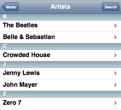
The button on the top right (“Search”) is mostly implemented using the following CSS:
border-width: 0 5 0 5;
-webkit-border-image: url(toolButton.png) 0 5 0 5 stretch stretch;
-moz-border-image: url(toolButton.png) 0 5 0 5 stretch stretch;
With toolButton.png looking like:

The premise behind border-image is complex, but easy to learn. When used in the manner shown above you are, effectively, providing slice offsets into the provided image – telling the browser how to position the slices.
For example the 5s in the border-width and border-image indicate that there should be a 5px-wide border on the left and right of the button. The contents of the border should be populated with the left and right-most 5 pixels from toolButton.png. Since a horizontal border width value is provided it is possible to scale the contents of the button horizontally (inserting more contents will allow it to continue to work properly).
The 0s, on the other hand, indicate that entirety of the button background should be consumed by toolButton.png – and that none of it should be used to show the border (border-image can be used as a crude mechanism for injecting background images). Because of this the image won’t be able to gracefully scale vertically.
CSS3.info provides another example that shows how the stretching and rounding work.
with the following base image:

Rounding:

Stretching:

By tweaking the stretching of the border-image you can end up with some truly-compelling results.
We can see another one in a second iui button:

With the following CSS being used:
-webkit-border-image: url(whiteButton.png) 0 12 0 12 stretch stretch;
-moz-border-image: url(whiteButton.png) 0 12 0 12 stretch stretch;
together with this base image:

border-image has a large number of compelling use cases. It’s fantastic to see some coordinated efforts by browser vendors to make their implementations common-place.


Brian McAllister (August 13, 2008 at 1:52 am)
I’d love to see the background-size property implemented as well – having both background-size and border-image would make creating scalable interface elements a long-awaited reality.
RichB (August 13, 2008 at 3:09 am)
I think you should be specifying units on your non-zero length values. So: border-width: 0 5px 0 5px;
pd (August 13, 2008 at 3:32 am)
I had REALLY hoped this was the extremely belated support for rounded boxes. We can already style buttons, I’m not sure we need another method for that, do we?
Please show me a meaningful example of this property being used to round a variety boxes. Also, I don’t know why, but I don’t seem to see much of a difference in those examples with
Mozilla/5.0 (Windows; U; Windows NT 5.1; en-US; rv:1.9.1a2pre) Gecko/20080812045727 Minefield/3.1a2pre
compared to 3.0.1 – my normal browser.
ilya (August 13, 2008 at 4:49 am)
Great news! Who will be next? I think Opera should!
IE? he-he :-)
dave (August 13, 2008 at 5:17 am)
I’d noticed before on the CSS3.info example that there seems to be a spurious spike of yellow just to the left of “lorum”. I assumed it was a rendering error in my browser, but it’s present in the reference gif too.
Also, I just noticed a moment ago that the ’tiled/rounded’ CSS3.info example breaks in an ugly manner (in Safari nightly on windows at the very least) when you change text size. Maybe specifying px would prevent that?
Sebastian Redl (August 13, 2008 at 5:48 am)
pd, isn’t border-radius already supported by Firefox?
John Resig (August 13, 2008 at 7:43 am)
@RichB: You’ll note that the CSS examples are just being taken directly from the iui stylesheets – I wasn’t changing anything in the interim.
@pd: Is this different from border-radius – which is already supported in Firefox? I’m not sure what you mean by “I don’t seem to see much of a difference in those examples” – do you mean that they already work in 3.0.1 or that they’re broken in both browsers for you. Because they definitely don’t work in Firefox 3.0.1. And they obviously work in the nightly (otherwise the above screenshot wouldn’t have been possible).
@dave: I agree – using ems to position a static background seems quite silly.
Chris (August 13, 2008 at 9:25 am)
John: It looks like you’re supporting a proprietary tool there (-moz-border-image) and not the standard border-image from the W3C. Correct?
John Resig (August 13, 2008 at 9:38 am)
@Chris: No browser vendor currently supports (as in uses the exact name of) border-image. I get the feeling that vendors fear that the spec may change at some point and want to hold off putting up a final implementation. To do it correctly in your own code you would need to do something similar to what the guys at CSS3.info do:
-o-border-image: url('border.png') 27 27 27 27 round round;-icab-border-image: url('border.png') 27 27 27 27 round round;
-khtml-border-image: url('border.png') 27 27 27 27 round round;
-moz-border-image: url('border.png') 27 27 27 27 round round;
-webkit-border-image: url('border.png') 27 27 27 27 round round;
border-image: url('border.png') 27 27 27 27 round round;
border: double orange 1em;
Pretty awesome, huh? (Sarcasm intended.)
Alex (August 13, 2008 at 9:39 am)
CSS3 isn’t finished yet (at least the part containing this rule), so people writing implementations shouldn’t use the normal rule name, they should add a vendor specific prefix to it (i.e. -moz and -webkit)
Once it’s finished and “stable”, the prefix can be removed.
Anyway, multiple background support and background-size would be great, but me sitting here saying that doesn’t do anything, I wish I knew enough to help out.
Chris (August 13, 2008 at 7:49 pm)
@John: Sarcasm heeded.
Glenn (August 15, 2008 at 9:24 am)
Can’t wait for border-image to become everyday web development.
Just wondering how a combination of border-image and background-image would function. Would the border-image in effect mask over the top of the background-image? Is it even possible for a background-image to show through if a border-image is used. Would the border-image need a transparent pixel in it’s centre?
Sudrien (August 15, 2008 at 2:46 pm)
@John: It’s not that browser makers are afraid of the spec changing, it’s because the W3C is afraid of a non-standard (early and incorrect) implementation becoming widespread. And the hacks that entails for web developers (if things get ‘fixed’ at all).
Robert Foxx (August 21, 2008 at 4:54 am)
This is like Deja Vu all over again – I’m certain I went through the whole “I cant wait until it’s a spec” thing with CSS ten years ago, over stuff like drop shadows and transparency.
Unfortunately I’m still a sucker for it – working on a new WordPress template with gracefully degrading rounded corners! :o)
danny (September 24, 2008 at 9:56 am)
I like the improvements – but btw: it raises the number of problems to build a website which is looking the same way in moz* _and_ ie*.
Kenny (September 24, 2008 at 5:26 pm)
It’s all kool. And don’t worry about making things look the same in ie and moz. Now that we do have some common standards, graceful degradation and progressive enhancement need to become common practice. Differentation between browsers belongs to the extra features, of which advanced css is a “selling” point ;)
Xanthir, FCD (December 5, 2008 at 6:24 pm)
border-image probably isn’t going to make it into IE8, but just in case, you’ll want to add the -ms- prefix to those rules too. The IE team recently revealed that they’re finally adopting the vendor-prefix approach to custom properties like everyone else.
@Glenn: You’d need to ask the w3-style mailing list to be sure (or pull down a FF nightly and see for yourself), but I know that the background box is drawn within the border box, which probably also means that it is drawn ‘on top of’ the contents of the border box in this case.
Matt (December 6, 2008 at 10:33 am)
@Glenn, Xanthir: Depends on the setting for background-clip (-moz-background-clip etc.); if you set it to padding, the background is drawn inside the border; leave it or set it to border and it draws underneath the border (I think).
Lea Verou (January 7, 2009 at 3:16 pm)
@danny: How does it do that, since you can always choose not to use it? :-S
Something optional can’t raise any problems, just open new possibilities.
Thijs (February 17, 2009 at 1:13 am)
For backward compatibility with Firefox 3.0, try the following:
border: 5px solid transparent;

-webkit-border-image: url(border.png) 5 stretch stretch;

-moz-border-image: url(border.png) 5 stretch stretch;
If you use:
border-width: 5px;
The border will be completely ignored by FF 3.0.
Ryan Cannon (May 11, 2009 at 3:15 pm)
Flash folks will recognize border-image as a CSS 9-slice-scaling technique. Thinking of the border-image as a nine-slice image image e.g. a tic-tac-toe board is the best way to conceptualize how useful this technique can be.
…this comment largely for the edification of Google.